DOCE X DOCE Competition

Earlier this semester, with colleague Merve Şanlı, we have participated in a student competition called Docexdoce. METU was a host for this competition and we went there to develop our design. The competition lasts 12 hours. The project is announced in the morning and the submission is due in 12 hours later.

This year’s design problem was to come up with a proposal for a project in the heart of Zurich, Switzerland. The site was the centre of the city, where the Globus building used to stand.

The place is currently used by Coop supermarket but is soon to be demolished. There are many proposals being made for the area. It is particularly important because the site has been a symbol for many things. When the government wanted to demolish it in 1968, the youth of Zurich took to the streets and started what would be called Globus Riots. They wanted this urban site to remain urban instead of a privately owned structure. The riots led to a debate in society and politics. Several leftwing parties as well as alternative forms of trading and housing such as cooperatives were spawned by the 1968 movement in Switzerland.

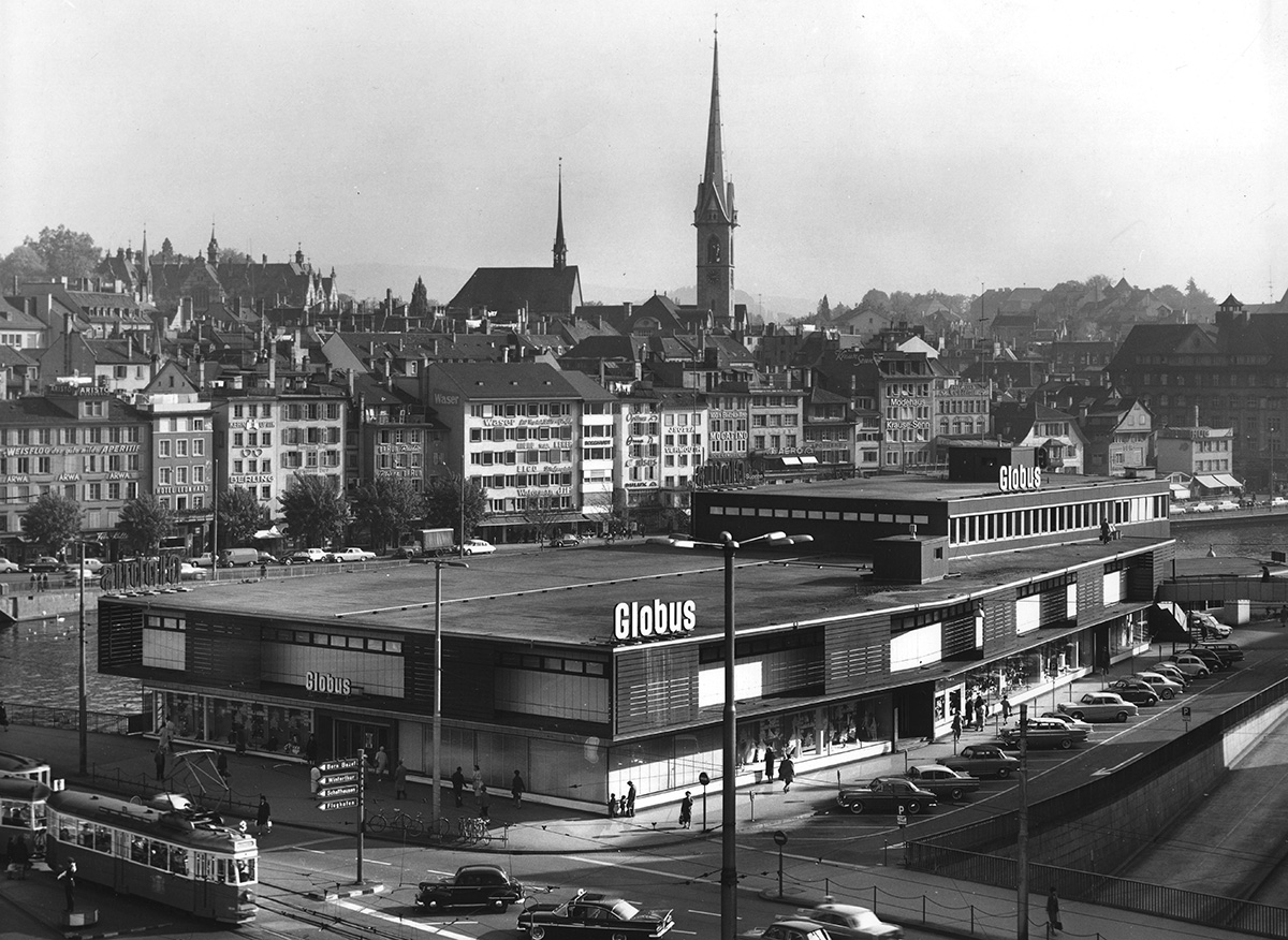
Another particular thing about the site was that the historical building behind the site was partially destroyed by a fire in 2018. So the site included the harmed part of the plot as well, so that we were free to make an interpretation of the area.

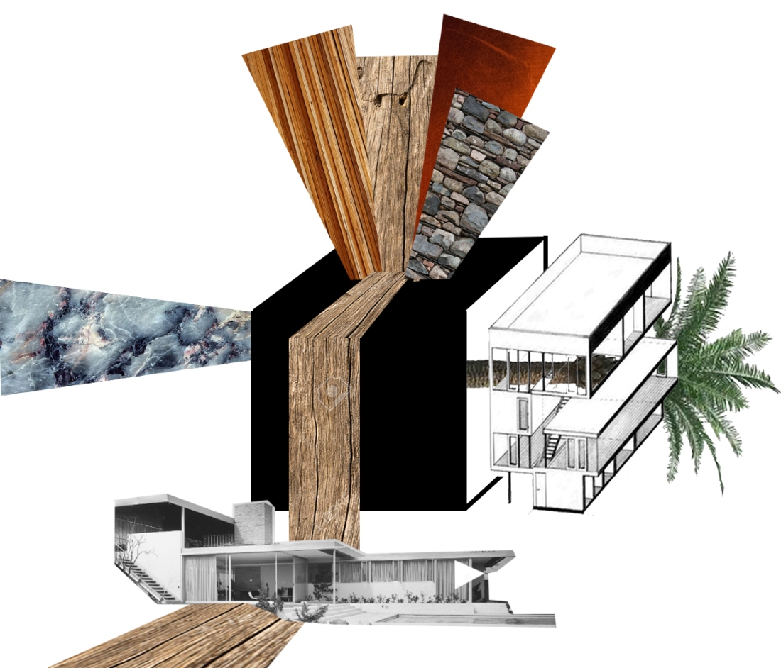
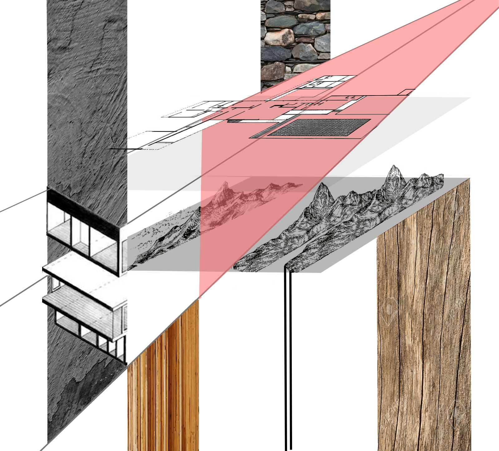
We wanted to create an urban area for cultural encounters and manifestations. The urban structure links the past to the future, the landscape to the urban and people to the city. Including libraries and cultural facilities it still remains an urban park for everyone to manifest themselves. Here is our competition poster:

Case Study Collage Revise

While coming up with a 3D collage, expressing the cases and phrases we are working with, I discovered the concept of the black box. I came up with the idea after thinking about one of my phrases “inhabiting the sublime” and the cases I analyzed. In most of the cases, the cube, or the box, was a very initial step in understanding the houses. I thought of this cube as the thing that everything happens inside. And we can only observe the extrusions of it. It covers all sorts of actions and situations that occur inside a “house”, it is all kinds of inhabiting. So inhabiting the sublime can only be distinguishable if I extrude it from the cube and define it outside of the cube, where it adapts itself and works with the second phrase reading the material. .. Continue reading “Case Study Collage Revise”

House Research & Collage

As our research on houses continue, we were assigned to work on a collage to gather our information and interpretation of the cases from a list of houses and random phrases. I found my phrases fun to work with which were “inhabiting the sublime” and “reading the materials”. And my list of houses included:

Le Corbusier, Villa Stein / France, 1927
Richard Neutra, Kaufmann House / California, 1946
Charles and Ray Eames, Eames House / LA, California, 1949
MVRDV, Double House / Utrecht, 1997
Diller + Scofidio, Slow House / New York, 1991
Nevzat Sayın, Yahşibey Evleri 1-7 / İzmir, 1996-2006
Rem Koolhaas/OMA, Dutch House / Netherlands, 1995
Aires Mateus, House in Azeitao / Portugal, 2003
ELASTICOSPA +3, Yuppie Ranch House + Barn / Italy, 2004

My interpretation of these on the collage has been a play of dimensions and surfaces while providing the information about the phrases I worked with.

ass-03_ecemolgun


The “What if…” Sketch Problem

In a part of our studio time, we were given a sketch study. Each student picked a small piece of paper and like a fortune cookie, the piece of paper had the information of the sketch problem we were each assigned with. They all consisted of fun “what if” architecture questions. Mine said “What if, Richard Meier designed Villa Dall’Ava by OMA?”. It was a challenging study because it required being familiar with both architects and designs by heart. I had to make a research on Richard Meier and learn the “essentials” of his designs while also studying Villa Dall’Ava and OMA’s motives and decisions behind the design. The process was fun and I’m quite happy with the end result. I might make some alterations after trying to think more like Richard Meier.

Font Styles and Typography

Fonts have various styles and qualities. Let’s start with the basics of the serif condition:

Serif Fonts are basically characterized by the flared extensions, or strokes, on the tips of letters.

Sans Serif Fonts are the ones that do not use that extensions. They have plain endings, and appear blockier than serif fonts. (“Sans” means without, and “serif” refers to the extra strokes, or lines.)

sans.jpg

Cursive Fonts resemble hand-written pen or brush strokes, often have artistic ornamentation, and sometimes have strokes that connect the letters together.

Monospace Fonts get their name from the fact that each letter takes up the same width of space.

Fantasy Fonts are primarily decorative, and are not designed to be used as the main font for long passages of text.

Fonts are designed and used according to the context they belong to. For example, Gothic writings were popular in the Western Europe till 17th century which is an intimidating font style that was used in highly sophisticated literature and religious texts. It was called Gothic by the Renaissance Humanists  because they thought it looked barbaric.

Nowadays, sans serif fonts are used more frequently because they are more legible and mostly useful for web and graphic design.

Here are some interesting typography I digged out:

e6deab29108835.55e308d69bc7a

Quick Impression Session with Corrugated Cardboard

In our architectural communication techniques course we have small sessions in which we have limited time to express the things, mostly buildings, that are shown to us. We tried sketching, using electrical tape and peeling off corrugated cardboards so far. Here are the actual buildings and what I have produced most recently by peeling off the cardboard:

FullSizeRender (8)

Midterm Drawing: Barcelona Pavilion

The_Barcelona_Pavilion,_Barcelona,_2010

As our midterm assignment we were given a plan and dimensions of the Barcelona Pavilion by Mies van der Rohe. We had 4 hours to produce the plan as an orthographic projection with the top and rear views and producing an axonometric drawing by making use of the top plan. Doing all of these in 4 hours was very challenging and many few of us made it to the axonometric projection stage. Here is what I produced (with the feedback I got from my instructors) :